The icons’ border and background settings can make a difference in how your icons look on any desktop or mobile device. Whether you’re going to use them as a simple background or as a more complex image playing a significant role in a design, you can do a lot to affect how they look on any device.
We can do many things with the icons we use in our apps and websites, and customizing the borders and backgrounds is one of them.
This article will show you how to customize the border and background of your icons.
A. Border:
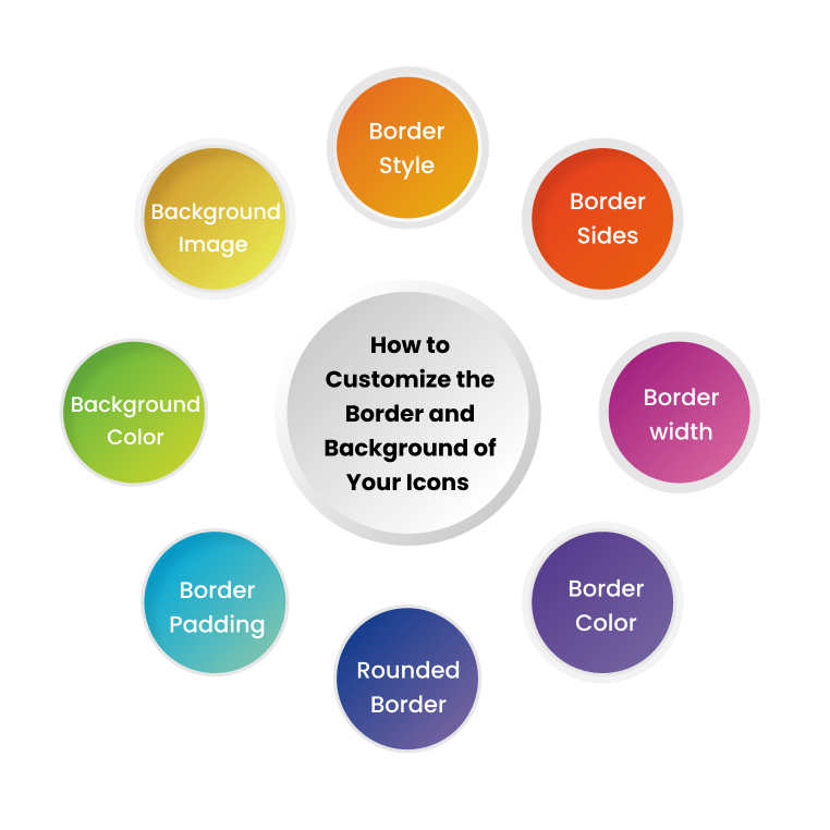
Borders play an essential role in designing whether an icon, application or website. It is the property used to define different elements like width, style, and color of the design border. It helps in making the design easy to understand for the users. Iamvector provides the features to modify the borders of the icon.
Border Types:
Different designs may necessitate different border types. CSS provides various designs for this purpose, including:
- On all four sides: The border is present on all the sides
- Only on the bottom: Border is present only on the bottom.
- On the left: The standard UI design method is the border on the left side.
- Rounded: The borders are either regular or round, and the rounding degree depends on the sides.
Border Style:
This is useful for displaying the border design in the icon. The following are some of the styles available:
- Hidden: The border is hidden.
- Dotted: The border is dotted.
- Dashed: The border is dashed.
- Solid: The border is Solid.
- Double: The border is double.
- Groove: The border is 3D grooved.
- Ridge: The border is 3D ridged.
- Inset: The border is a 3D inset giving the element an embedded appearance.
- Outset: The border is 3D outset giving the element an embossed appearance.
- Note: The border is absent.
In case no border is specified, the border is absent from that design.
Border Sides:
Variable values of the border are set, defining border style for each side: Top, bottom, left, right. Different values have shown different designs on the specified side. Take a look at the combinations that can be tried on it:
- If four values are present, then, you can design it:
Top= solid
Bottom= double
Left= dotted
Right= dashed
- If three values are present, then you can design it:
Top= solid
Bottom= double
Left and right= dotted
- If two values are present, then you can design it:
Top and bottom= solid
Left and right= dotted
- If one value is present, then you can design it:
All sides are solid
Border Width:
In CSS, It defines the width of all four sides borders that are set by using values like
- Keyword = px, pt, cm, em
- Length = thin, medium, thick
Different values for each side can be defined as per the design. If only one value is set, the rest of the sides will pick the same width. If two or all values are defined, then it will reflect on the outcome of the design.
Border Color:
Property sets the color of all four sides of the borders, and if it is not selected border picks up the color of the element. The color is set by specifying the color name, setting the values of HEX, RGB, or HSL.
Similar to border style, it also has values ranging from one to four representing the border’s left, right, top and bottom.
Border Shorthand:
All the values of individual properties like color, style, width, etc., are set in one property. You can separate them by giving them space. You can write the declarations in long-form or shorthand.
It can make the code short and crisp, but the chances of error also increase.
Rounded Border:
The edges of the border can be simple or rounded. Different values set the edges from slightly round to roundest. The border-radius property sets the elements of the border. Here also the property is set for one value to all four values.
Border Padding:
It is used for separating the element content and the border. The absence of padding leads to no space between the content and border. For adding the padding, values used are either length or percentage ranging from positive to negative. The negative value does not render, but the positive ones render. You can set it for one to four values, just like other properties.

B. Background:
It is the property used to create and manage the background of the elements of the design in the project.
Background-attachment:
It makes the background image fixed or movable w.r.t. to the whole page. If the background image is kept fixed, the image will not move while scrolling, and if it is scrollable, you can see it while scrolling the page.
Background-Color:
The property is used to define the color of the element’s background. The color is set with the color name, setting the values of HEX or RGB. You can specify the transparency as well in the same property to manage the color of the elements. It ranges from opaque to transparent background. You can add values to it from 0.0 to 1.00. Lesser the value, more the transparency.
Background-Image:
The property sets an image in the background of the element. The background images are fixed where the image covers the element completely.
Background-position:
The position of the background image is decided by using this property. The top-left place in the web page is the default for it, but you can set on other positions like:
- Top
- bottom
- left
- right
- center
Background Shorthand:
Similar to borders, all the values of individuals in backgrounds are set in one property. This can be a time-saving technique.
Look for some other factors for customizing the border and background of the icon:
Having your icons border the left side of the page is one of the most common and basic UI design patterns.
You have to:
- Decide on a color and style for your icons, and you can also experiment with transparent or semi-transparent backgrounds.
- Create a project in Photoshop to choose which brush and layer style to use, and customize the spacing between the icons.
- Use GIMP to crop, sharpen, and colorize your image.
Use this guide to help you customize the appearance of your icons in no time.
- Open your desired vector icon with Adobe Illustrator, and select the pen tool (P).
- Click and drag to create a shape with the pen tool, which will become your border.
- Use the Line tool (L) and draw a shape for your background color.
- With the shapes selected, go to Object → Expand Appearance.
- Select both shapes, then go to Object → Group.
Last words:
The icons’ border and background settings can make a difference in how your icons look on any desktop or mobile device. Customizing the borders and backgrounds is one of the most important features you can add to your icons using Photoshop and Illustrator. In CSS, It defines the width of all four sides borders set by using values like Px, pt, cm, em. If only one value is set, the rest of the sides will pick the same width. The border-radius property sets the elements of the border. The background-attachment property makes the background image fixed or movable w.r.t. to the whole page. It is used to define the color of the element’s background. You can specify the transparency as well in the same property to manage the colour of the elements. In this way, the icons can be customized.