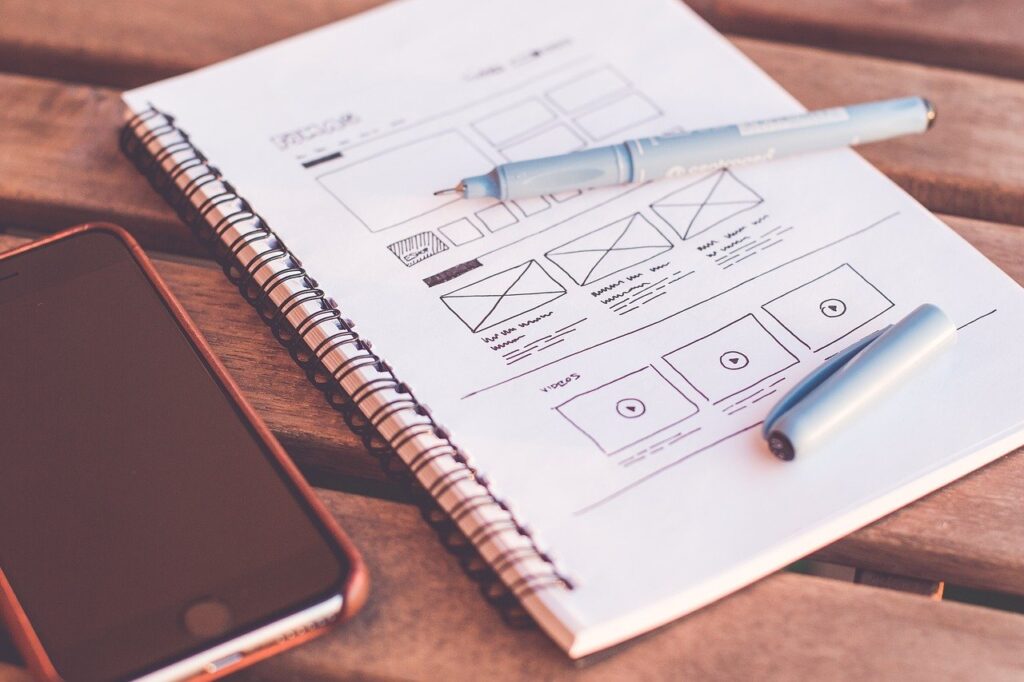
How to increase the number of customers and conversion rate is the question every business owner asks staying in the constant search for the solution. Indeed, there are a lot of tips, tricks, and strategies to use with the aim of attracting new customers and turning them into loyal ones. However, there are also simpler but no less powerful approaches that will streamline your lead generation efforts. Just get started by reconsidering your website design and follow the tips we share in this article.
Add a Lead Magnet
A lead magnet is the main lead generation tool. It takes a form of a popup that appears in response to a certain action, for example, when the user shows an exit intent and offer them to get some benefit – for example, a free trial, a personalized discount, free shipping, piece of valuable content or any other perk you would like to share.
There are several important points you should consider before creating a lead magnet. Firstly, pick up the right tool for this purpose. OptinMonster is the ultimate solution for lead magnet creation and conversion boost. Also, make sure the design of your lead magnet should match the design of your website and look organic in terms of colors and prints. And as for the last point, it should promote a relevant offer your users would like to grab. That’s why it makes sense to create several popups with different lead magnets and test each one.
Reconsider White Space and Content Placement
If you have ever used the heat mapping technique for your users’ acceptance testing, you may know that different design elements attract their attention in a different way, causing either the desire to proceed with your website or to close it forever. To attract the attention of your users to the right elements and seamlessly move them to the target action, reconsider the ways you place your content, and most importantly, the ways you use white space since the latter reinforce the impression from other sections, making it holistic.
In a nutshell, try to come up with such a design solution that will allow your users to find the most important information and avoid distractions. Since the first impression we get is always visual, your task is to make the right impression and generate leads with the help of your design. If it seems too difficult for you, get started with these free design courses to learn the basics.
Also, pay attention to the quality of your content. If you are struggling with creating top-notch materials, hire the best content marketing specialists for your project.
Empower Your Website with a Clear Call to Action
Your call to action is one more important and conversion-boosting element of your web page design. Your task is to make it clear and embed it in the right place. Calls to action should also be short and compelling, instantly driving customers to the necessary action. To simplify this task, you may use a Call to Action Generator, but don’t forget to test different calls and compare conversion rates to find out what works best for your customers.
Make Your Customers Feel Design-Provoked Emotions
The design of your website is your key opportunity to make your customers feel the emotions that will drive them to purchase. Have you ever thought about why the owners of luxury hotels use full-fledged images of their accommodations, and the owners of spa salons use photos of a relaxing atmosphere? All this is done to make you feel the necessary emotions and make an impulsive purchase. And this is just what you need to do as well if your business implies making instant decisions. This approach works perfectly for B2C. However, it may also be realized for B2B – check the following examples to find out how it may work for this sphere as well.
Match Your Design Colors with Your Values

The colors you use are quite important for the visual impression your website makes. To get more customers, you should be clear with your values and the colors of your website design are one more tool for promoting them. For example, according to the science of psychology, blue is the color of trust and stability, while violet is the color of deep philosophy. So, if your goal is to attract more customers with your design, make sure the colors you use match your business values, and most importantly, the values of your potential clients.
Add Trustworthy Testimonials
Modern customers are very picky when it comes to the products or services they use. That’s why before proceeding with the purchase, most of them will look for reviews and testimonials. And this is one more design opportunity – just share the best testimonials right on your website. Most website owners add a testimonials carousel, plus add some statistics on the number of completed orders and satisfied customers. Numbers also work well in the website design and are one more social proof that drives your conversions.
Conclusion
Improving your website design with the aim of making it more conversion-driving isn’t challenging – just follow the tips we have shared in this article. Also, keep track of the modern web development practices, the strategies your competitors use and never underestimate your customers’ specifics and preferences.

Author Bio:
Melissa Mauro is a self-improvement author who is always interested in new projects. She wants to create her own writer brand, that’s why Melissa is looking for fresh platforms for the implementation of her ideas.