
Digital presentations often receive a negative critical response, and there is a set of good reasons for that. Long and boring slideshows are worse than no slideshow at all. Since the goal of every presentation is to assist the audience in understanding the topic better, an effective PPT should follow a set of clearly defined requirements for it to convey the main point well.
Now, a poorly and nicely made presentation might not differ in content much but vary in design and organization of this content. The delivered speech can be flawless, but if the slides are overloaded with text, use unreadable fonts, or contain distracting backgrounds, you can’t expect that the message will hit home.
This short guide is created for correcting common mistakes in the creation of presentations and providing ideas of what instruments one should use to make the slideshow neat and coherent.
Simple and Effective Tools to Create a Powerful Presentation
If you are wondering how to make a good PowerPoint presentation, why choose something so standard if you could go for creative alternatives instead? The visual side is the biggest factor determining how successful you will be, so here we will disclose the range of irreplaceable programs for creating great designs.
Visuals are extremely important since your audience will most likely perceive around 90% of information from images, schemes, and infographics; what they hear, however, will be less effective and sooner forgotten. Based on the purpose of slide creation, you can pick presentation programs from the software on this list to make wonderful designs.
1. Fastreel.
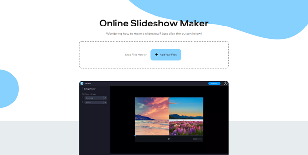
As both a video editor and presentation-making tool, this one allows accomplishing complex operations with visual content without having the special skills for merging or looping videos, resizing, cropping, or compressing files of different formats. With this outstanding slideshow maker, all you need is to throw the files you want to include, choose a fitting transition option, background sounds, slide duration, etc.
2. Apeaksoft Slideshow Maker.
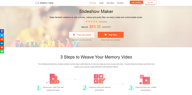
This instrument is also focused on editing videos, converting, and sharing all types of multimedia using convenient file formats. As a slideshow helper, it offers a wide choice of effects to insert into a presentation or video, as well as free customizable templates with neat yet advanced looks.
3. SlideDog.
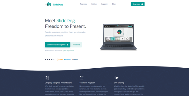
Some spheres require demonstrating statistical data and using higher technology to boast of the results in public. If you are not a born technician but need to mix up files and parts of PPT into one salad, this presentation tool will come in handy and let you carry out such tasks in a wink. The tool actually makes up a ‘playlist’ of the files where nothing moves uncontrollably, unlike in many other PowerPoint alternatives.
4. Visme.
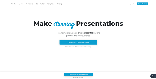
If all slideshow presentation software was this comfortable, there would be no issues with data loss or effective sharing between platforms. Visme makes creating, editing, and printing documents and media files simple due to cloud technology.
5. Keynote.
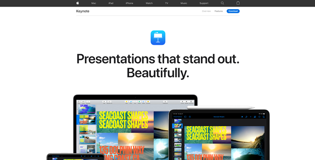
This Apple tool designed for all Mac and iOS devices can combine presentations from Microsoft PowerPoint and other files, allows collaboration and teamwork, and brilliantly stands out with the function of making interactive charts and other complex graphic elements, which is great for visualizing figures, results achieved in certain timelines, and statistics.
6. Beautiful.ai.

Dreaming about a minimum-effort design maker? Once you try Beautiful.ai, you will be sure there is no better tool for lazy people. This free assistant contains a vast library of slides and templates that are easily mixed together in a single style and are ready to use from the start.
In fact, the list of products that make presentations look great can be continued more and more. But even with these top 6 tools, your presentation delivery will be transformed.
What Flaws You Should Skip When Starting to Make a Digital Presentation
Including text in your slides should be done correctly so that viewers would read from the slides as little as possible.
- Never use more than six text lines.
This volume of text is too much and will make the audience tired. - Present one idea per slide.
Bullet points might be great for big texts in Word documents, but while sharing slides, it’s better to focus on one thing at a time than confuse everyone with 10 points on the screen. - Find balance in the colors and size of the text.
What makes letters readable is the high contrast between the picture (or background) and the words. Plus, it’s better to use not more than three colors in the whole presentation. - Eliminate text where possible.
If you’ve got much to visualize, why use words? Show charts, diagrams, pictures (again, one per slide) to create a strong emotional appeal and hook the onlookers.
To wrap it up, an outstanding presentation is just a matter of moderation in the usage of text, good taste in choosing templates, ingenious simplicity, and, sure thing, reliable presentation tools.