Every year presents over 365 new design opportunities for logo makers and 2019 is no different. We can’t exactly tell what’s going to set new waves in the design industry or what is going to fail, but the least we can do is look forward to some of this year’s spiffy new logo design trends that many businesses are itching to utilize.
1. Gradient Logos
From a variety of online design source, it is predicted that gradients will be a gigantic trend in 2019. Of course, Instagram may have introduced this concept to us in its rebrand back in 2016, it has only gained more notoriety since then. Through the blending of colors, designers can choose from a wider color palette, which creates something fresh and engaging all at once.
2. Geometric Logos
There’s something awfully alluring about straight lines, shapes, and symmetry. Geometric logos are an excellent style that checks off all of those aspects, while still giving room for creativity. Shapes can be both simple and elaborate as you want to make them out to be. You can choose to add color, duplicate the original shape or make the whole shape 3D. Geometric logos are gaining traction in just about every industry from construction to interior design and apparel. This is the ideal logotype for entrepreneurs who’re looking for a minimalist design without forsaking detail and originality.
3. Semi-Flat Logos
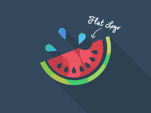
What do you get when you give 2D design some depth? A semi-flat design like the image above shows. It creates an astonishing three-dimensional feel that is both simply, yet alluring. These designs make it seem like they’re being lifted off the page. And the reason why these logos have been picking up steam lately is due to how strong they look online.
4. Textbox Logos
It’s pretty hard to imagine how textboxes can be seen as a design trend, probably because they’re nothing new. However, Cat van der Werff from Canva explains how versatile this logo design can be and why most people will be gunning for it in 2019. She says text boxes give greater image usage opportunities. This can also mean that box colors can be changed, bold or even be a little retro.
5. Double Initial Logos
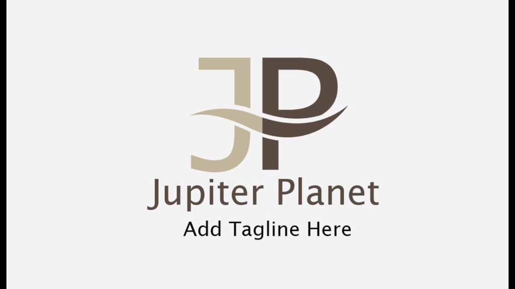
It looks as if the double-initial logos are making their comeback, and it appears 2019 will give us more to that. It’s actually a pretty sweet concept if you know how to make it work as shown in the image above. There are plenty of design variations of double initial logos, like two uppercase letters, two lowercase letters, a mix of both and joint letters. More importantly, it’s the font size and style that can help a double-initial logo stand out against the more popular logotypes.
6. Neon Logos
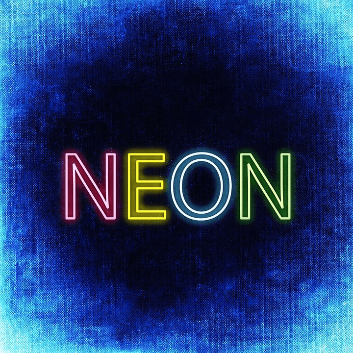
According to freelance graphic designer Sony Nirvana, neon logos are looking to have a renaissance. This may be also be the fact that the 80s are going to be popular this year as well, with neon colors being part of this trend. Whether you decide to adapt your logo into a 3D neon like that of McDonald’s or keep it mainly for print and digital collateral, neon creates an attractive presence due to its statement font and color palette.
7. The Single-Image Logo

Do you want to know what Apple, Dropbox, Instagram and Target have in common (apart from their obvious name value and recognition)? They all have logos that are represented by a single image instead of letters or geometric shapes. The only problem is that people won’t know the brand’s name right off the bat. Well with enough marketing and brand awareness, a single image can be more effective than a couple of words.
You may also like to read: Great Tips on How to Design Your Business Logo