The best way to “sell” yourself as a freelancer is to create a quality portfolio. In it, you reflect your work and attract customers. Every freelancer should have a portfolio. If you do have, ask yourself a few questions: how much time do you spend on improving your portfolio? One thing is for sure – whatever your portfolio is, it can always be improved.
Table of Content
- Intro
- Create An Outstanding About Me Page
- Draw Attention To Your Works
- Show, Not Tell
- Make The Menu Convenient
- Display The Best
- Work With An Individual Approach
- Stand Out
- Optimize The Size Of The Logo
- Remove All Unnecessary And May Minimalism Be With You
- Do Not Forget About Testimonials
- Keep In Touch With Clients
- Final Word
Intro
Before hiring a specialist, every employer has to learn about the professional skills of a possible employee. And how does he do it? Right, with the help of a portfolio, since it’s the first indicator of your capabilities. An online portfolio is also important in order to stand out among the applicants and show yourself from the best side since there is no visual contact with a person and you can’t make a good impression with anything other than skills.
On the other hand, like every freelancer, your work schedule is completely undefined. You often spend days and nights working for customers, while you almost never have time to work with your personal website. However, if you want to make or freshen a website, but your budget is not so big to pay developers, then you shouldn’t turn to free services. A huge amount of advertising and poor design do not look good for you. There is a very simple, not expensive and pretty convenient way out of the situation – WordPress themes. These portfolio themes have a lot of advantages, and one of the main ones is that you don’t need any programming skills to create a portfolio. And if you spice up your portfolio site with excellent sauce in the form of fonts, logos, and other creative elements from MasterBundles, it’s easy to prove that you deserve the project.
In this article, I will reveal some secrets of a successful portfolio to help you get the job. These tips are suitable not only if you want to collect your projects together in one place for the first time, but also if you plan to update your portfolio site. Also, if you need some ideas, see these 30 awesome portfolio designs for inspiration.
And now, let’s look at the tips!
Create An Outstanding About Me Page
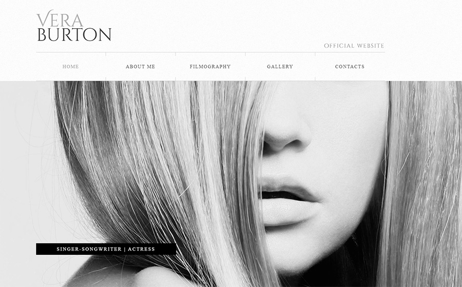
Spend some time and create the perfect About Me page. Do something unusual and memorable on this page that can offer a real look at who you are. Here, for instance, you can see Vera Burton. It has a wonderful About Me page and gives a lot of opportunities to customize it.
Draw Attention To Your Works
One of the basic rules for the development of a portfolio site: the focus should be on your works and not on the design of the site. The purpose of the site is to present your works in the most favorable light. For example, due to the design of Gravitas, all eyes will be on the elements and pictures you choose.

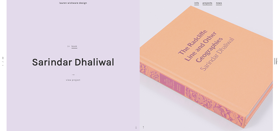
Lauren Wickware organized effective viewing with continuous showcasing of works, placing the main page and the portfolio page in one screen. Thus she can quickly and attractively present the most interesting projects to visitors.
Show, Not Tell
The site, like a business card, says a lot about you. More precisely, it shows a lot about you. You need to make sure that the first thing your visitors see the is a positive visual impression before they start reading. In his article about a portfolio of UX designer, Micah Bowers writes that simple project descriptions and visuals are more effective than technical jargon and splashy imagery.
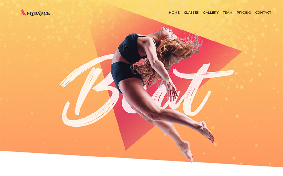
To see what I’m talking about, pay attention to Flydance. The theme is organized in such a way that everybody falls in love with dances just opening the site.
Sites with black and white WP design will never lose popularity. Richard Gore is a perfect example when flawless black and white site can show more than you expected.

Watch a short video on 5 Tips to Make Your Portfolio Better
Make The Menu Convenient
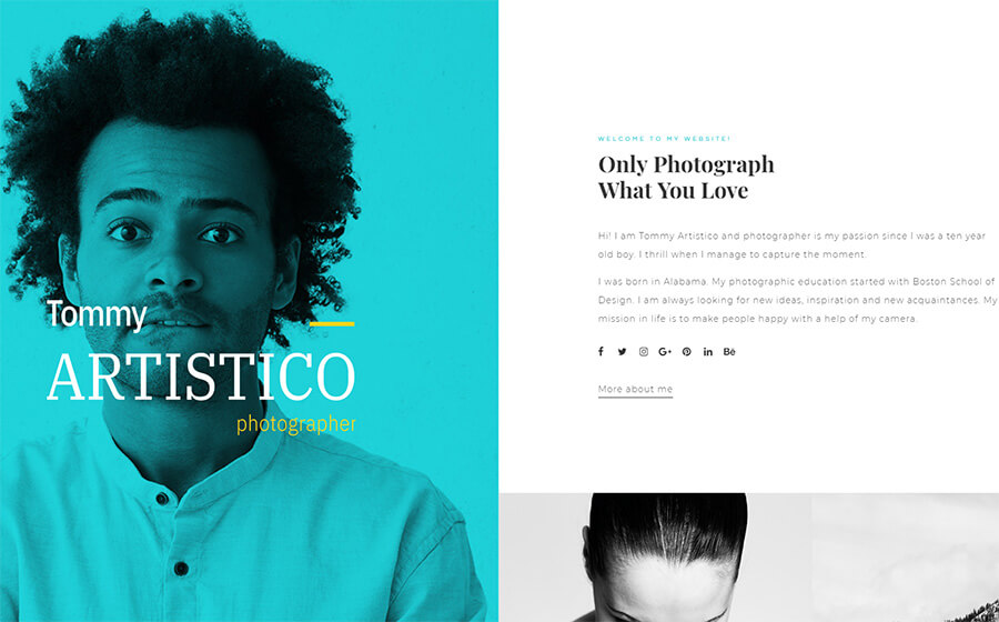
To make it easy for the client to find what he is looking for, put important sections such as Portfolio, Prices, Testimonials, About Me, Contacts in the menu. The convenient and clear site is half of success. Make it clean, easy to navigate, and fully focused on the works. Tommy Aristico has a hidden menu which appears when you need it. Pay attention to this convenient feature.
VictorWork is one more example when a menu is hidden but easily found and at the same time, it doesn’t interfere to enjoy the works.
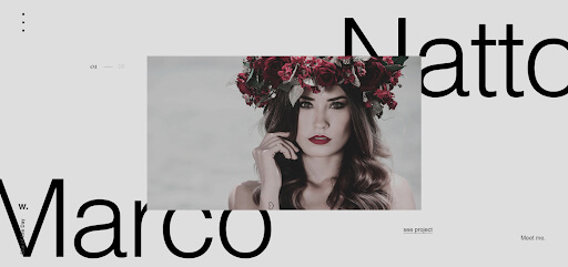
Recordex illustrates the way your menu can be convenient and always on display.

Display The Best
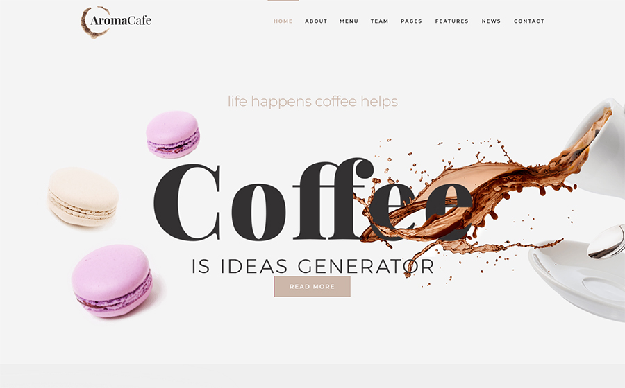
No need to stack everything in a portfolio. Emphasize most attractive and illustrative projects that help to unleash your creative and professional potential in the best way. Aromacafe easily helps to generate the boldest ideas, at the same time showing your customers only the best part of you.
Work With An Individual Approach
There are different factors that contribute to the conversion. The most important of them is the uniqueness of the design. This is easy to achieve if you manage to give your site a special look. Present the information in an interesting way and give it a creative touch.
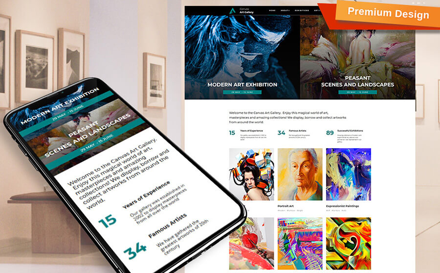
Every artist or photographer will appreciate the design and premium features of Canvas for giving a lot of space to show their individuality. You can definitely draw inspiration from it.
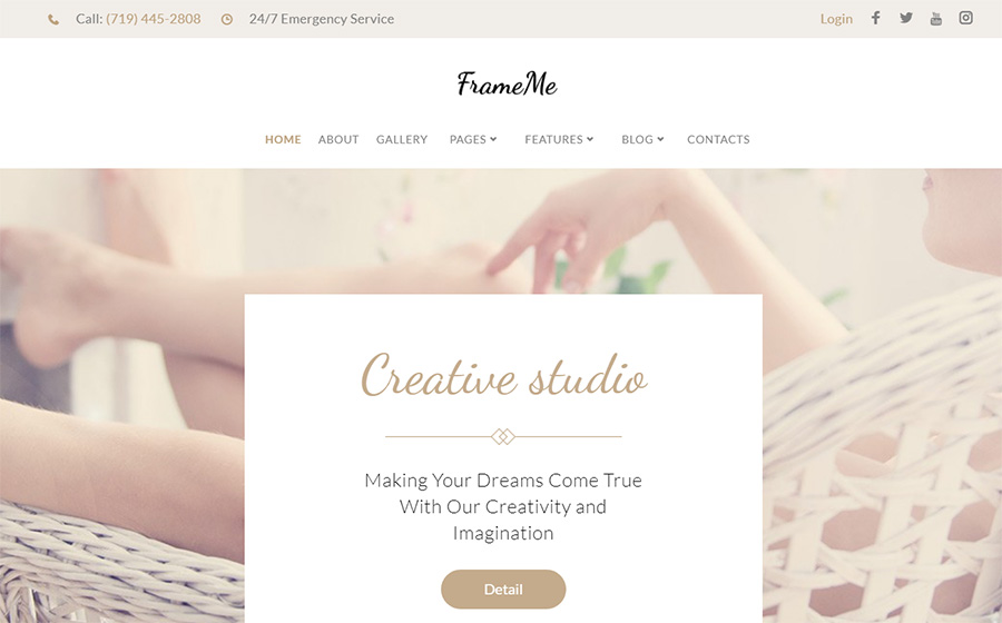
Sometimes, your personality needs such expression as FrameMe: simple, tender, and customizable.
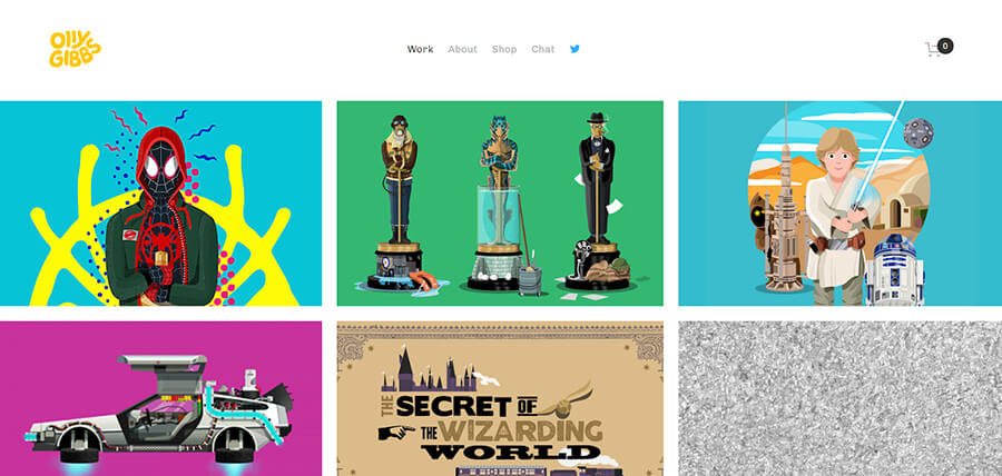
Olly Gibbs showed his personality due to a catchy design with a touch of humor, adding original aesthetics to all of this.
Watch a short video on how to Create A Killer UX Design Portfolio
Stand Out
Your portfolio website should emphasize your difference from competitors. Work so that your portfolio is not confused with the works of competitors. And in any case, do not copy the portfolio of another person from your sphere. This will only reduce your professional level in the eyes of the customer.
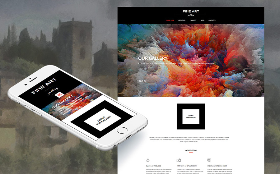
Art Gallery is a very good example of the theme to stand out. Bright, extraordinary and responsive – nothing else needed.
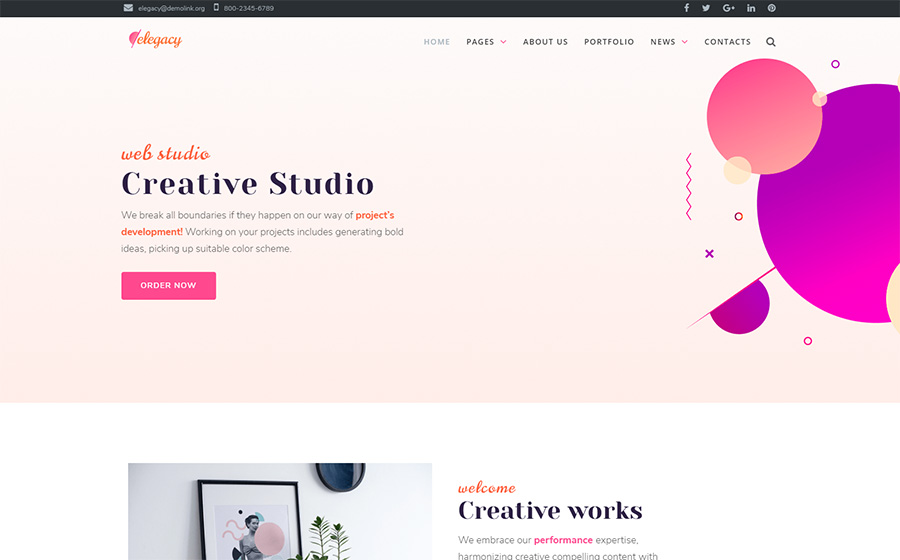
Geometry is another win-win way to stand out among others, which is why sites like Elegacy definitely attract people’s attention.
Optimize The Size Of The Logo
A common mistake in the design of the site is a too large logo, sometimes – half of the screen. The most important thing on the site is your professionalism, not the size of the logo. Check what attracts attention when visiting the site – the logo or your works.
Remove All Unnecessary And May Minimalism Be With You
If you want to create a portfolio website, the main rule to follow is not to overdo it. As the content on the site grows by adding new projects, there can be a lot of information on the pages, which reduces the efficiency of its perception. Magnifix demonstrates pretty well what happens when using a creative minimal theme with premium features for a portfolio site. Do you need more inspiration? Look at these portfolio HTML templates.

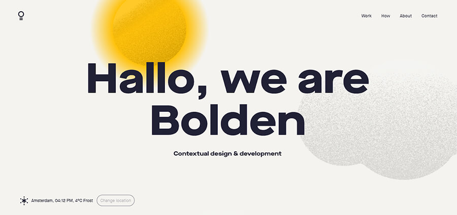
The creative minimalist design of Bolden did an excellent job with the site’s selling task, attracting but not drawing attention to itself.
Do Not Forget About Testimonials
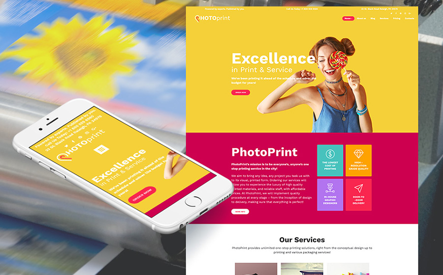
Confirm all your words with facts: photos from resources, customer feedback, previous works. While there is no such information, you can simply leave the section blank. You can have a separate block for testimonials like in the Print Shop or even a whole page – it’s up to you.
Keep In Touch With Clients
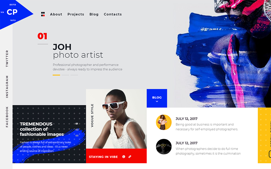
Provide your clients with different options for contacting you: via the contact form, by phone or email. Do not forget to add links to social networks. Customers will choose the most convenient way and will contact you. If you want to see a perfect contact page, look at CPM – and you yourself will understand what I’m trying to tell.
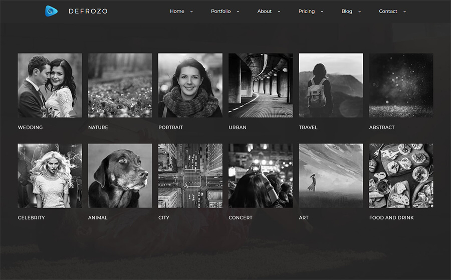
Defrozo even has not one option for designing a contact page but three ones – everything to present information in the most convenient way for a customer.
Final Word
I hope these tips will help everyone who is working on creating their portfolio website and tell in which direction to go. And if your site already works, be sure to look through the article once more: there is always something to improve. I wish you only interesting projects, inspiration, and satisfied customers. 🙂